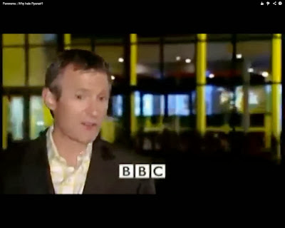
This first still shows a regular on screen presenter talking about what topic this programme is going to based on. This is usually the same bases with many other documentaries broadcast as well as including the channels logo it is to be shown on or filmed by. This can usually be shown on set of where ever the main location is going to be the "highlight" of the documentary or can be set against a background of any sort as long as its clear by having onscreen or third person narration what the documentary is going to be about, this is because the audience would have no clue by seeing the setting to give it away.
Mise en Scene in this shot is a close-up of the presenter shot in front of a lite up building. The reason why I believe this to be used is because this is a well known documentary called 'Panorma' and as we would later see as the camera slowly zooms off of close-up to more of a long shot, we then see the 'Panorma' logo on the building which gives a great significance that the building is of Panorama and this is where all the investigations take place. Therefore, this is to create the sense of the presenter being at home and then going away to investigate the chosen topic the documentary is to be about.
Once there has been an intro given by narration, this is usually followed by 10 seconds of fast cuts of whats to be featured in the programme. This can be cuts of the location, interviews and customer opinions. Already, by this point the viewer will feel as if they would be interested in watching the documentary or would rather not. Therefore this is crucial in keeping viewers interested so that they don't turn over the channel rather than watching the documentary.
Mise en Scene in this shot is an aircraft that belongs to 'Ryan Air' which has been shot using medium- close-up of being in mid-air. I believe the reason why this has been used is so the audience is clear on what is happening and what the topic is, in this case of an airline and views this cut aways now and again and a reminder of what the programme is about.
This is also a still taken from the fast cut introduction. This is a still of a person who this documentary is based around. These stills have been taken from BBC Panorama which is all about Ryan Air. Therefore, in this case the reason why we see the man above is because he is the owner of the airline.
Here, in this shot we see the owner of the airline and is shot walking holding documents which is creative in a sense of media as this shows someone with importance. This is to clearly indicate this person is important and with a man behind him as well as the man in front are both wearing smart clothing which also indicates the sense of importance.
Once the programmes introduction has been shown, there is then a title sequence or short cut of the programmes title. This is usually used to advertise the programmes name.
The logo is creative as it is a sphere shape which represents the earth with multiple windows of images which indicates this is a programme which investigates all means and information all over the world.
We then cut back to the on screen presenter or in some cases third person narration heard over the top of shots shown. In most documentaries we see an onscreen presenter with them narrating throughout the programme as well. Again, this is the programme being introduced in more detail.
Again, mise en scene is of the brightly lite building with dark flooring but the presenter appears to be lite by a spotlight which brings importance to the presenter and shows the presenter is the key importance to this shot.
This is a shot of the location being talked about or "featured" in the programme. I believe this is critical for a documentary to show this as otherwise the audience are going to have no clue what is being explained to them as well as what they are relating to.
Mise en scene in this shot appears to be of an airport as of a close up of a pop-up poster of a Ryan air craft advertising the destinations of which it flies to. In the distance behind this it shows inside the airport as we see the check in desks with passengers wishing to check in. This again in a cut away which has the job of reminding us again the key topic of this documentary, so that the audience don't lose focus on what the documentary is about.
As well as many other documentaries, 90% of the time a documentary includes an interview of some kind. This can be spoken over the top of a cut away or on screen. This includes titles showing the name and sometimes who they are.
Mise en scene is of a man which has his name edited on top of the shot, which appears to be shot in a garden with the garden shed which indicates this to me. However, the reason why I believe this to have been used is to show this person as being an outsider away from the main focus of the documentary. This can often be used in a documentary
This links with above, as well as including an interview on screen customers/ public opinions have been shown on screen using text. I believe this keeps a documentary interesting as it is not following the same old conventions as many other documentaries which is using on screen interviews and using something initiative and different.
Mise en scene is of a deep blurred background which appears to be the location of where the documentary is focusing on. This keeps this shot of customer opinions interesting and keeps it linked to the subject of the documentary without causing the audience to lose focus and show this is still part of the topical discussion. To me this also gives the sense of an outsiders opinion, this being shown in a way of someone who is not related to this location has commented in a negative way as we do not see an on screen appearances of anyone who has made these comments.
Once the main bases of the programme is over we then cut back to the programmes regular on screen presenter. This is so the same method that is used at the beginning of the programme as an introduction but as an overview and to conclude the documentary.
Again we see the building behind the presenter which again brings the sense of being the High Quarters with the presenter again highlighted by a spotlight which shows the viewers the focus of this shot is on the presenter talking.
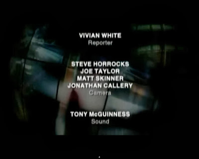
Finally, at the end of most documentaries it is followed by credits which lists all the people who have been involved with the programme and any locations and extras used.


Conor,
ReplyDeleteThis is quite a creative entry, I like the fact that you are using stills and integrating text. However, there are some important areas in which I think that this could be improved:
- You have not referred to media language in enough detail. For example, there is no reference to camera shots here (Why have they used medium close-ups, long shots, etc)
- There is also no reference to elements such as mise-en-scene or sound. Even though we cannot hear what is happening, you could describe this. Note that sound is an important part of documentary
- Finally, it is vitally important that you include some form of concluding paragraph in which you say 'what you have learned from the research'. You MUST always say what you have learned and how you intend to use this information in your own documentary. Even if you only choose 2 or 3 things, you must show that this research has some relevance to your own documentary idea
Mr Bird
Conor,
ReplyDeleteI am pleased that you are taking on my advice from the previous post and I think that this is a much better entry. However, there are still a couple of issues and/or improvements that could be made:
- You must check the spelling, there are some mistakes in the opening (You have mispelled Panorama, for example) and in the conclusion
- Avoid made-up percentages, I.e., you make a claim that 90% of docs do a certain things and yet this is not born of statistical evidence
Mr Bird